
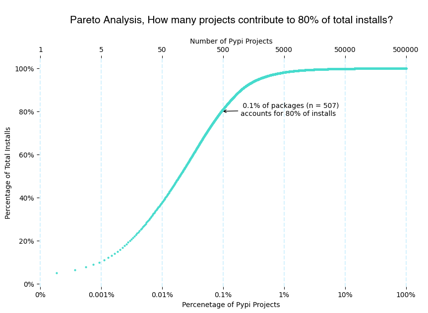
Last month, I wrote an article about a project to analyze the monthly downloads of Pypi packages. Since I only had one month’s data, I analyzed the distribution package installs, and we found that ~500 packages contribute to around 80% of installations.
I downloaded June’s dataset this month, so I now have two months of data: May and June 24. I will use these two datasets to identify June 24 trending packages. This article will explain the methodology and process for identifying the trending packages.
Goal
There are two crucial questions I want to answer using the two months’ data.
-
What are the top new packages?
-
What are the top trending packages?
In this article, I’ll focus on answering question #1. However, we can answer both questions using the same methodology, comparing the package installs between May and June. If the number of installs in May was 0, this is a new package.
How can we visualize the analysis?
I used scatter plots for this purpose, where each point represents a package, the X axis represents May installs, and the Y axis represents June installs.
Trial #1: Not great, but you need to start somewhere.
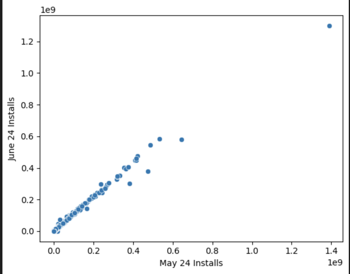
On the x-axis, you can see May and June installations on the y-axis. But you can barely see any dots in this scatter plot because of Outliers; this dot on the top right is a package with 10^9 that makes the axis so huge that almost all the other packages fit 1 line between 0 and this package May and June downloads.
How can we solve this? Look at trial #2
Trial #2: Log scale charts.
Log scale is handy for drawing data with skewness and outliers instead of having linear (normal) steps, i.e., 1,2,3,4. The logarithmic scale has exponential steps of (usually 10s), i.e., 1, 10, 100,1000. This means we zoom a bit more on the small numbers, but we also keep the big numbers on the photo frame; perfect, no?
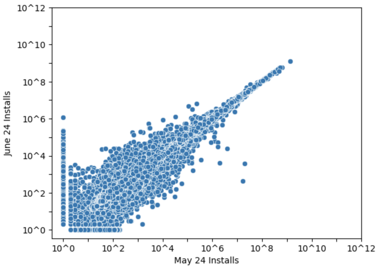
Now, it is a different picture. By changing the scale, we can see more variations in the bottom left package, with 1000 and 10000 package downloads per month. However, we still see too many points which is normal because we have too many packages, now it is the time to start group things together. Which will lead us to trial # 3
Trial #3 Grouping things together
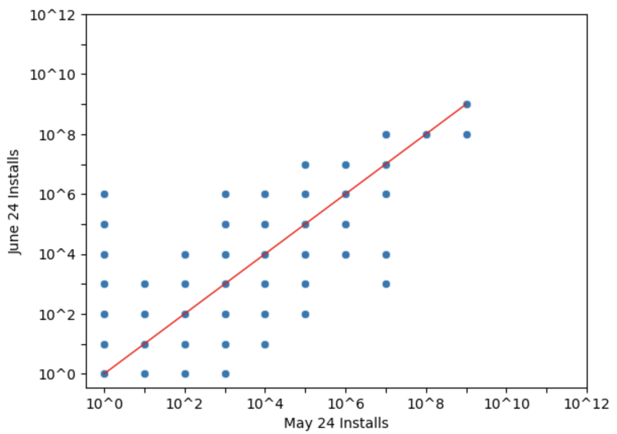
WTH we did to move from trial 2 to trial 3?
Simple, we rounded things to the closest exponential. This means that there’re a lot of overlapping points, but I can now start thinking of the things that I’m very interested in:
-
Packages above the redline: those packages got more downloads in June than in May, with a special focus on the packages that showed 0 downloads on May 24, but in June, we see 10k+ downloads (let’s call them New & Trending packages).
-
Packages below the redline, those packages got less downloads in June than in May, they might be dying projects, but for the sake of focusing on the positive side of things, we will not be looking much into those.
-
Packages on the redline, I like to call it the boring line, those packages maintain the same level of downloads between May and June. From the MoM comparison, those are not very interesting to us. In the previous article, we talked about the most downloaded packages (the top right dots)
Things became more interesting, no? Now it is time to share the last version. The goal now is to answer the question of how many packages fall in each bucket outside the boring line. Now, let’s look at the final version.
Final Trial. Wrapping things together
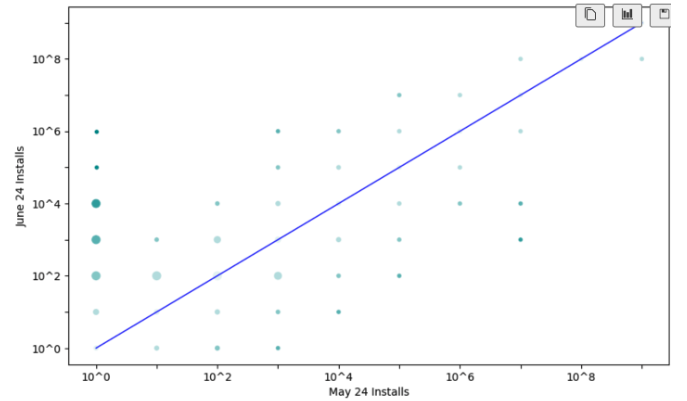
In this chart, the size of each dot represents the number of packages, while the color represents how far it is from the boring line. The farther the point from the boring line, the more interesting it is. I purposely removed the details, i.e., how many packages fall into each bucket. However, from the look and feel, it seems that we have more new packages than dying packages.
Now, can you answer the question I asked earlier: What are the top new packages?
If we deep dive into the 3 dots in the top left. We can easily identify those packages.
| Rank | Project | May 24 Installs | June 24 Installs |
| 1 | ultralytics-thop | 0k | 1219k |
| 2 | pinecone-plugin-interface | 0k | 232k |
| 3 | zeroize | 0k | 213k |
| 4 | sagemaker-mlflow | 0k | 151k |
| 5 | rencrypt | 0k | 100k |
| 6 | llama-cloud | 0k | 74k |
| 7 | jaydebeapi3 | 0k | 68k |
| 8 | redefine | 0k | 62k |
| 9 | opentelemetry-instrumentation-threading | 0k | 60k |
| 10 | python-oxmsg | 0k | 56k |
